The 70 30 rule in interior design is a proportion guideline that divides a room’s visual elements into a dominant tone covering 70% of the space and a contrasting or complementary accent covering the remaining 30%. It creates visual balance without making a room feel flat or chaotic. Homeowners, renovators, and designers use it to make confident colour, material, and finish decisions — especially when planning a renovation where every choice has a cost attached to it.
The 70 30 Rule Defined: What the Split Actually Means
The 70 30 rule states that 70% of a room’s visual weight should come from one dominant tone — typically walls, large floor areas, or major fixed surfaces — while 30% comes from a secondary accent applied through fixtures, fittings, cabinetry, or feature elements. The rule creates a clear visual hierarchy that prevents a space from feeling busy or unresolved, giving the eye a place to rest and a point of focus.
How the 70% Dominant Tone Works in a Room
The dominant 70% is the foundation of the space. It sets the overall mood and should be the most neutral or consistent element in the room. In most residential interiors, this is the wall colour, large-format floor tiles, or the primary surface material. The dominant tone does not need to be a single colour — it can be a tonal family, such as warm whites, soft greys, or natural stone tones, as long as it reads as unified across the space. Choosing this element first anchors every other decision that follows.
What the 30% Accent Allocation Covers
The 30% accent is where personality enters the room. This portion covers secondary surfaces and feature elements — cabinetry finishes, tapware, tile feature walls, vanity tops, or decorative fixtures. The accent does not need to be bold to be effective. A matte black tapware set against a soft white tile field, or a warm timber vanity against a cool grey wall, both follow the 70 30 principle. The accent creates contrast and visual interest without competing with the dominant tone for attention.
How colour and finish choices shape the final result depends on how well these two proportions are defined before any materials are selected or ordered.
How to Apply the 70 30 Rule Room by Room
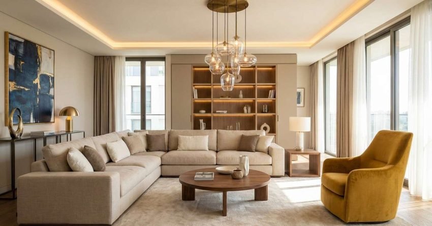
Applying the 70 30 rule starts with identifying the largest fixed surfaces in the room and assigning them to the dominant 70% first. Walls and floors typically carry this role in living areas and bedrooms. In kitchens, the dominant tone often sits across cabinetry and benchtops. The accent 30% then fills in through splashbacks, hardware, pendant lighting, or soft furnishings. The rule works across every room type because it is a proportion principle, not a colour prescription.
Adapting the Rule for Bathrooms and Renovation Spaces
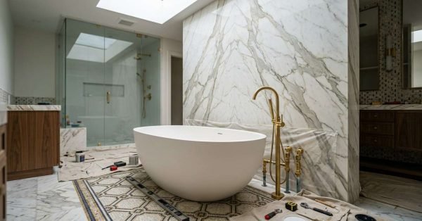
Bathrooms present a specific challenge because the surfaces are fixed and expensive to change. Getting the 70 30 split right before construction begins matters more here than in any other room. The dominant 70% typically covers wall tiles, floor tiles, and the primary vanity finish. The accent 30% is expressed through tapware, shower fittings, mirror frames, and any feature tile or niche detail. When planning your bathroom renovation, locking in the dominant tone first prevents costly mid-project changes to materials already ordered or installed.
When the 70 30 Rule Works — and When to Adjust It
The 70 30 rule works best in spaces where simplicity and calm are the design goal — bathrooms, bedrooms, and open-plan living areas benefit most. It is less rigid in spaces where layering is intentional, such as a feature-heavy kitchen or a styled entertainment room. Some designers extend it to a 60 30 10 split, adding a third accent layer at 10% for small decorative elements like artwork or plants. Both approaches share the same underlying logic: one dominant tone, one supporting accent, and a clear visual hierarchy. The 70 30 version is simply the more restrained of the two — and for renovation spaces where finishes are permanent, restraint is usually the smarter starting point.
Conclusion
The 70 30 rule gives every room a clear visual structure by separating the dominant tone from the accent in a deliberate, proportional way. For renovators, it is one of the most practical design tools available because it simplifies decision-making before materials are committed and costs are locked in. At Sydney Home Renovation, we help homeowners apply principles like this from the planning stage — so every finish decision is intentional, on budget, and built to last.
Frequently Asked Questions
Is the 70 30 rule the same as the 60 30 10 rule?
No. The 70 30 rule uses two proportions — a dominant tone and one accent. The 60 30 10 rule adds a third layer at 10% for small decorative elements. Both follow the same visual hierarchy logic.
Does the 70 30 rule apply to bathroom design?
Yes. It is particularly useful in bathrooms where surfaces are fixed and expensive. Assigning wall and floor tiles to the dominant 70% and tapware or feature tiles to the 30% creates a balanced, cohesive result.
What counts as the dominant colour in the 70 30 rule?
The dominant colour is the tone covering the largest surface area — typically walls, floors, or primary cabinetry. It does not need to be a single shade, but it should read as visually unified across the space.
Can you use the 70 30 rule with neutral tones only?
Yes. The rule is about proportion, not contrast. A room using warm white walls at 70% and soft greige cabinetry at 30% follows the principle effectively, even without strong colour contrast between the two elements.
Does the 70 30 rule apply to materials and finishes as well as colour?
Yes. The rule extends to texture and material weight. A matte tile covering 70% of a bathroom wall paired with a gloss or veined feature tile at 30% applies the same proportion logic to surface finish rather than colour alone.