The right renovation colour palette selection starts with understanding colour theory, testing samples, and applying the 60-30-10 rule for perfect balance. Sydney homeowners often feel overwhelmed by endless paint chips and colour options. This confusion leads to costly mistakes and rooms that feel wrong.
We help Sydney families create beautiful, cohesive spaces every day. We understand how natural light, colour impact, and room function shape the perfect palette. Our approach turns colour chaos into confident choices.
This guide teaches you proven methods for choosing a home colour scheme that lasts. You will learn simple rules that designers use for stunning results.
Introduction to Colour Theory
Colour theory gives you the tools to pick colours that work together. This knowledge helps Sydney renovators avoid clashing tones. The basics are simple to learn.
Colours sit on a wheel in a specific order. Complementary colour harmony uses colours from opposite sides. Analogous colour flow uses colours that sit next to each other. Triadic colour balance picks three colours spaced evenly apart.
Understanding these relationships saves time and money. You can predict which colours will look good together. This foundation makes every other decision easier.
Understand Your Space
Room-specific colour strategies depend on your space’s unique features. Every Sydney home has different lighting and layouts. These factors change how colours appear.
Small rooms need special attention. Lighter tones create openness in tight spaces. Dark colours can make small rooms feel cramped. The right choice makes rooms feel bigger.
Open-plan colour unity matters in modern Sydney homes. Connected spaces need colours that flow together. Sudden colour changes create visual confusion. Consistent palettes make homes feel larger and more welcoming.
Balance Trends and Timelessness
Trend-proof palette selection protects your investment for years to come. Sydney property experts confirm that timeless colour choices support stronger resale outcomes. Trendy colours can date your home quickly.
Earthy hues, nature-inspired tones, and soft greys remain dominant interior colour trends heading into 2025. These colours feel fresh but won’t look outdated soon. They work with many furniture styles.
Homes finished in warm neutrals and soft whites tend to appeal to a broader pool of buyers, and research from realestate.com.au shows neutral, well-presented interiors can support faster sale times in competitive markets like Sydney. Neutral base colours allow future décor changes without frequent repainting. This approach saves long-term renovation costs, since you can update accessories instead of repainting entire rooms.

Find Inspiration & Define Mood
Look Around You
Inspiration surrounds you in everyday life. Nature offers endless colour combinations that always work. Sydney beaches show blues, tans, and whites together. Local gardens display greens with bright flower accents.
Fabrics, artwork, and magazines spark ideas too. Mood board curation helps you collect favourites. Digital platforms like Pinterest organise your inspiration. Take photos of colours you love in restaurants and shops.
Set the Atmosphere
Colour psychology shapes how rooms feel. Calm colours such as blues and greens support relaxation in bedrooms. Warm neutrals create welcoming living spaces.
Energising palettes work well in active areas. Choosing warm yellows for kitchens adds cheerful energy. Calming hues suit spaces meant for rest. Match the colour to the room’s purpose.
Consider Architecture
Your home’s style guides colour choices. Federation homes suit different palettes than modern builds. Heritage Sydney properties often look best with traditional tones. Contemporary homes can handle bolder choices.
We always aim to complement your home’s architectural style for visual harmony. Original features like trim, door frames, and ceiling details matter. Colours should highlight these elements, not fight them.
How to Create Your Colour Scheme
Creating a colour scheme follows a clear process. Start with your inspiration images and mood boards. Identify the colours that appear most often. These become your starting point.
Consider the lighting temperature in each room. North-facing Sydney rooms get cooler light. South-facing spaces receive warmer tones. This affects how paint colours look on your wall.
Texture adds depth to any scheme. Smooth surfaces reflect more light than rough ones. Mixing matte and gloss finishes changes how colour appears across a room. Combining textures adds visual interest.
Choosing the Right Paint Finish
Paint finish affects how a colour reads on your wall just as much as the colour itself. Matte finishes hide imperfections and suit low-traffic areas like bedrooms and ceilings. Satin and eggshell finishes work well in living areas because they resist marks while still looking soft.
Gloss and semi-gloss finishes handle moisture and cleaning best, which makes them ideal for kitchens, bathrooms, and trim. We recommend testing your chosen colour in your intended finish, since sheen level can shift how light or dark a colour appears.

Select Your Colours (The 60-30-10 Rule)
The 60-30-10 rule creates perfect colour balance every time. This simple formula guides professional designers worldwide. Sydney renovators use it for reliable results.
60% Dominant Colour
Wall colour dominance sets your room’s main tone. This colour covers most surfaces, including walls and large furniture. Soft whites, light grey, and soft neutral tones work well here.
Choose calming, versatile shades for this largest portion. Bedroom palettes often use soft blues and greens. Living room palettes often feature warm neutrals. This base colour anchors everything else.
30% Secondary Colour
Secondary colours appear on furniture, curtain fabrics, and rug choices. This layer adds visual interest without overwhelming. Flooring colour pairing often falls into this category.
Pick a colour that complements your dominant shade. Cabinetry colour integration in kitchen spaces uses this principle. Bathroom vanity colours follow the same rule. This middle layer creates depth.
10% Accent Colour
Bold accent colours bring energy to any space. Vibrant accent pops appear in small doses. Think lamp shades, plant pots, mirror frames, and artwork.
Metallic accent finishes add glamour in this category. A statement door colour can serve as an accent. Backsplash tiles in kitchen spaces often provide this pop. Small touches make big impacts.
Test & Refine
Use Large Samples
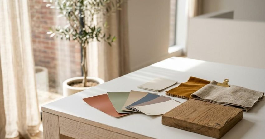
Sample pot testing reveals true colours before you commit. Small swatches lie about how colours really look. Use large paint samples on walls or boards to test real-world appearance.
Paint samples at least A3 size on your actual wall. Move them around the room to see different effects. This step prevents expensive mistakes.
Check Lighting
Observe colour changes under natural and artificial lighting at different times of day. Morning light differs from afternoon sun. Sydney’s bright natural light affects colours differently than cloudy days.
Lighting temperature matters for evening appearance too. Warm bulbs make colours look different than cool LEDs. Test samples under your actual lights, and check colours at night as well.
Mind Undertones
Check undertones in whites, greys, and beiges to avoid unintended warmth or coolness. Every neutral contains hidden colour casts. Some whites lean pink. Others lean green or yellow.
Countertop colour harmony depends on matching undertones correctly. Trim colour contrast looks best when undertones align. Compare samples against pure white paper to reveal hidden tones clearly. Viewing swatches side by side in natural daylight is the most reliable way to catch a mismatched undertone before it becomes a costly repaint.
Live With It
Live with samples for several days before finalising your choice. First impressions can mislead you. Colours grow on you or become annoying over time.
Digital colour visualiser tools help but don’t replace real samples. Walk past your samples daily and notice your reactions each time. This patience prevents regret.
Common Colour Mistakes to Avoid
Even careful renovators make avoidable colour mistakes. Knowing them in advance protects your budget and your finished result.
Choosing colour before lighting is a common error. Many homeowners pick a shade under shop lighting, then find it looks completely different at home. Always test in the actual room first.
Ignoring flow between rooms is another frequent mistake. A bold colour that works in isolation can feel jarring next to an adjoining space. Skipping large sample testing and relying on tiny swatches also leads to regret, since small chips can’t show how a colour behaves across a full wall.

Should You Hire a Colour Consultant?
A professional colour consultation can be a smart investment for larger renovations. Consultants bring trained eyes to undertone matching, room flow, and architectural fit that can be difficult to judge alone.
For smaller single-room updates, following the 60-30-10 rule and testing large samples is often enough. For whole-home renovations, extensions, or second-storey additions, we find that coordinating colour decisions alongside your renovation contractor helps keep the palette consistent with cabinetry, flooring, and trim choices made during construction.
Tips for Cohesion & Balance
Limit Your Palette
Limit the overall palette to three to five colours to avoid visual clutter. Too many colours create chaos. Simple palettes feel sophisticated and calm.
Pastel softness works well with limited palettes. Earth tone schemes use few colours effectively. Monochromatic schemes use one colour in different shades. Restraint creates elegance.
Flow Between Rooms
Maintain colour flow between rooms using variations of the main palette. Hallway colours connect separate spaces. Sudden colour changes feel jarring.
Well-coordinated, cohesive colour schemes tend to make homes feel more move-in ready to buyers. Use your dominant colour throughout the home. Change accent colours room by room. This creates unity with variety.
Don’t Forget the Ceiling
Ceiling colour often gets overlooked. Consider subtle ceiling tints instead of default white where suitable. Soft tones add warmth and interest.
Light blue ceilings feel airy and fresh. Warm white ceilings suit cosy spaces. Match ceiling tones to wall undertones. This small detail makes rooms feel complete.
Balance Warm & Cool
Balance warm and cool tones to prevent spaces from feeling too cold or too heavy. Warm colour schemes need cool accents. Cool tone palettes benefit from warm touches.
Furniture colour coordination helps achieve this balance. Wood tones add warmth to cool schemes. Blue accessories cool down warm rooms. This balance creates comfortable spaces.
Conclusion
Choosing a colour palette for your renovation becomes simple with the right approach. Start with inspiration and understand basic colour theory. Apply the 60-30-10 rule for guaranteed balance, and test samples thoroughly before committing.
Sustainable, low-VOC paint options protect your family’s health without compromising on colour choice. Repainting continues to deliver one of the highest returns among renovation upgrades, and the right colours boost both everyday enjoyment and property value.
We at Sydney Home Renovation are your trusted renovation contractors for complete home transformations. We help Sydney families create beautiful, cohesive spaces they love, from single rooms to whole-home renovations. Contact us today to start your colour journey with expert guidance.
Frequently Asked Questions
How many colours should I use in a renovation palette?
We recommend limiting your palette to three to five colours total. This keeps spaces feeling cohesive rather than chaotic. The 60-30-10 rule helps distribute them correctly.
What is the 60-30-10 rule in interior design?
It’s a formula where 60% of a room uses your dominant colour, 30% uses a secondary colour, and 10% uses an accent colour. This ratio creates balanced, professional-looking results in any space.
Should ceiling colour match the walls?
Not always. A soft tint that matches your wall’s undertone often looks more finished than plain white. Warm whites suit cosy rooms, while cool blues suit airy, light-filled spaces.
How do I know if a white paint has the wrong undertone?
Compare your sample against pure white paper in natural daylight. If it looks pink, green, or yellow next to the paper, it has a strong undertone that may clash with your fixtures.
Do trendy colours affect resale value?
Trend-driven colours can date a home faster than timeless neutrals. Sticking to soft whites, greys, and earthy tones tends to appeal to a wider range of buyers if you plan to sell.
Is it worth hiring a colour consultant for a small renovation?
For single rooms, following the 60-30-10 rule and testing large samples is usually enough. For larger renovations involving multiple trades, coordinating colour with your contractor helps keep everything consistent.