Choosing the right bathroom colour scheme starts with three anchors: a dominant neutral, a complementary mid-tone, and one accent that ties fixtures, tiles, and lighting into a cohesive palette. This simple formula works for any Sydney bathroom size or style.
Colour shapes mood, perceived space, and resale appeal. In Sydney’s property market, a thoughtful palette protects renovation value and lifts daily comfort for many years.
This guide walks through colour theory basics, popular palettes, lighting effects, material coordination, and a simple step-by-step process for selecting your perfect new scheme today.
Why Bathroom Colour Schemes Shape Renovation Outcomes
Your bathroom palette does more than decorate. It influences how large the room feels, how relaxed you feel inside it, how well the space ages, and how attractive it looks to future buyers. A confident colour choice anchors every other decision you make about tiles, vanities, tapware, and lighting.
Sydney bathrooms often face challenges that colour can solve. Many are compact ensuites or internal rooms with limited natural light. Reflective light palettes can visually expand cramped footprints. Warmer schemes can soften cool, south-facing rooms. Darker, dramatic palettes can give larger family bathrooms a hotel-style atmosphere when balanced correctly.
There is also a financial dimension. Bathrooms consistently rank among the highest-return renovation rooms in Australian property valuations, and dated or polarising colours can drag valuations down even when the construction quality is excellent. A timeless palette protects your investment and gives prospective buyers a neutral canvas to imagine themselves in.
Colour sits alongside layout, fixtures, and finishes as one of the core decisions that shapes the entire renovation outcome, which is why it deserves the same careful planning as your budget and timeline.
Bathroom Colour Theory Made Simple
You do not need a design degree to choose well. Two simple frameworks will guide almost every decision you face.
Warm, Cool, and Neutral Undertones
Every colour carries an undertone. Warm undertones lean yellow, red, or orange and feel inviting, intimate, and grounding; they suit bathrooms where you want to feel calm and cocooned. Cool undertones lean blue, green, or purple and feel clean, spa-like, and energising; they work well in bathrooms designed to feel fresh and modern. Neutrals such as white, beige, greige, and grey can sit on either side of the spectrum depending on their base.
The most common mistake Sydney renovators make is mixing undertones unintentionally. A cool blue-grey wall paired with a warm beige floor tile will fight each other under every lighting condition. Pick a side, then build the palette around it.
The 60-30-10 Palette Rule
Use this proportional formula for balance:
- 60% dominant colour: walls, large tiles, ceiling
- 30% secondary colour: vanity, floor, feature tile
- 10% accent colour: tapware, mirror frame, towels, art
This ratio prevents visual chaos and gives the eye a clear hierarchy. It works for minimalist schemes and bold contrast schemes alike.
Popular Bathroom Colour Schemes in Sydney Homes
These six palettes consistently perform well across Sydney’s mix of coastal, inner-city, and suburban properties.
White and Natural Timber
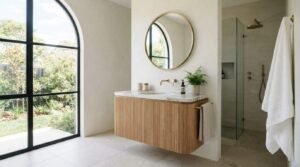
Crisp whites paired with oak, walnut, or American Ash vanities deliver a Scandi-coastal look that suits Sydney’s light-filled homes. It photographs beautifully, ages well, and appeals to almost every buyer. Pair with white or light grey grout to keep the look seamless, and add brushed brass or matte black accessories to give the palette a finished edge.
Soft Greys and Greige
Warm greys and greige tones (grey with a beige base) create a modern, calming feel without the starkness of pure white. Pair with brushed nickel or matte black tapware for contemporary balance.
Navy, Charcoal, and Brass
A deeper, hotel-inspired palette for family bathrooms or main bathrooms with generous natural light. Navy or charcoal joinery with brass or aged gold tapware adds richness and warmth. Keep walls light to prevent the room feeling closed in.
Earthy Warm Neutrals
Mushroom, taupe, terracotta, and limewash tones have surged in popularity. They suit heritage terraces and Federation homes, pair beautifully with travertine or natural stone, and feel grounded rather than trend-driven. Brushed brass tapware and honed stone vanity tops complete the palette without pushing it into territory that dates.
Sage, Stone, and Botanical Tones
Soft sage green or eucalyptus tones bring a fresh, organic feel that connects bathrooms to Australia’s natural palette. They pair well with timber, off-white tiles, and aged brass.
Each of these schemes can be dialled up or down depending on bathroom size, light, and personal style.
Matching Colours to Bathroom Size and Natural Light
Light changes everything. The same paint sample can look entirely different in two bathrooms on opposite sides of the same house.
Small Bathrooms and Light Reflection
For compact ensuites and powder rooms under six square metres, lean toward lighter, reflective palettes. Off-whites, pale greiges, and soft warm neutrals bounce light around the room and expand perceived space. Use large-format tiles in similar tones to minimise grout lines, which can visually fragment a small space.
If you love dark colours, apply them strategically. A single feature wall, a deep vanity, or moody floor tiles paired with lighter walls and ceilings can deliver drama without shrinking the room.
Ensuite vs. Main Bathroom: Adjusting the Palette
Ensuites are typically smaller and more personal, so they tolerate bolder or moodier palettes that a main bathroom might not. A deep charcoal or rich sage works beautifully in a compact ensuite where the goal is atmosphere rather than broad appeal. Main bathrooms serve more users and benefit from a more restrained, universally appealing palette; save the personality for accessories and tapware rather than fixed tiles and joinery.
Orientation and Artificial Lighting
North-facing Sydney bathrooms receive warm, generous light and can handle cooler palettes without feeling cold. South-facing or internal bathrooms with limited natural light benefit from warmer undertones to compensate.
Always test paint and tile samples under your actual bathroom lighting at different times of day. LED colour temperature matters too. Warm white (2700K to 3000K) flatters warm palettes. Neutral white (3500K to 4000K) suits cool and contemporary schemes.
Coordinating Colour with Tiles, Fixtures, and Materials
Your palette is more than paint. In a bathroom, hard surfaces dominate the visual field, so tile, stone, and metal selections drive the scheme.
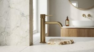
Start with your most expensive, hardest-to-change elements first. Floor tiles, wall tiles, and stone vanity tops are major financial commitments and typically last fifteen to twenty years. Choose these first, then layer paint, tapware, mirrors, and accessories around them.
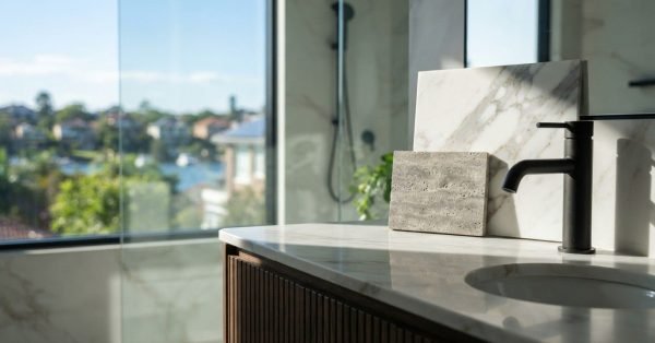
Tapware finish is one of the highest-impact decisions. Chrome reads neutral and timeless. Brushed nickel softens cool schemes. Matte black anchors contemporary palettes. Brushed brass and aged gold warm up dark or neutral schemes beautifully. Pick one finish and use it consistently across taps, showerheads, towel rails, and handles.
Grout colour is often overlooked but transforms how tiles read. Light grout with white tiles creates a seamless modern look. Dark grout with white tiles delivers a strong graphic, almost industrial feel. Match grout to tile for a calm, contemporary finish. The same principle applies when you carry a palette into an adjacent laundry or wet area; consistent grout and tile tones across connected spaces create a unified feel that reads as intentional rather than accidental.
Choosing the Right Paint Finish
Paint finish affects both appearance and durability in a high-humidity environment. Low-sheen finishes offer a soft, elegant look and perform well in bathrooms with good ventilation. Semi-gloss is the most practical choice for most Sydney bathrooms; it resists moisture, wipes clean easily, and holds colour well over time. Matte finishes look beautiful in photographs but absorb moisture and are difficult to clean in steamy conditions. Always choose a bathroom-specific formula with mould and moisture resistance, regardless of sheen level.
Step-by-Step Process to Choose Your Bathroom Palette
Follow this sequence to remove guesswork and avoid expensive mistakes.
Step 1: Define the mood. Write down three words for how you want the bathroom to feel. Calm and spa-like. Bright and energetic. Moody and hotel-inspired. This single decision filters every option that follows.
Step 2: Assess the room. Measure size, count windows, note orientation, check existing fixed elements (a window frame, a heritage tile floor, a vanity you plan to keep). Honest assessment prevents palette decisions that fight the room.
Step 3: Anchor with the largest surfaces. Choose your floor tile first, then your wall tile. These represent the largest visual fields and the largest dollar commitments.
Step 4: Layer in the vanity. Pick a vanity finish that complements your tiles. White or stone tops suit almost everything. Timber, navy, sage, or charcoal vanities add personality.
Step 5: Choose tapware and accessories. Use one finish throughout. Mixing two finishes rarely works and almost always reads as indecision rather than intentional contrast. Stick to one and commit.
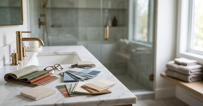
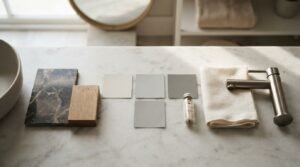
Step 6: Sample, sample, sample. Order paint samples, tile samples, and stone offcuts. View them in the actual bathroom under both daylight and evening light. Live with them for at least three days before committing.
Step 7: Pressure-test resale. Ask yourself whether a typical buyer in your suburb would walk in and feel positive. If the palette is highly personal, ensure walls and accessories carry the personality rather than the tiles or stone.
Common Bathroom Colour Mistakes to Avoid
A few predictable errors cause most regret. Watch for these before signing off on selections.
Mixing undertones unintentionally is the single biggest mistake. A warm beige floor under a cool grey wall will never look right. Hold samples together before purchase.
Following trends too literally is the second. Bold patterned encaustic tiles and saturated jewel tones look striking in photographs but can date quickly. Anchor with timeless materials and express trends through paint, mirrors, towels, and art that are cheap to refresh. Over-tiling a small bathroom in a strong pattern is a related trap; what looks dynamic in a large showroom display can feel overwhelming in a compact ensuite.
Forgetting the ceiling is another. A bright white ceiling in a warm-toned bathroom can read as a harsh interruption. Consider painting the ceiling a shade lighter than the walls in the same undertone family.
Ignoring fixed elements you plan to keep is a costly oversight. If you are retaining an existing window frame, floor tile, or heritage feature, those elements must anchor the new palette, not fight it. Assess every fixed element before choosing a single new colour.
Finally, skipping samples costs the most money. A tile that looks perfect in a showroom under bright overhead lighting can look completely wrong in a small south-facing ensuite. Always sample on site.
Conclusion
The right bathroom colour scheme balances undertone, proportion, and light while coordinating tiles, fixtures, and finishes into one cohesive story. A timeless palette protects renovation value and makes every day in the space feel considered.
Sydney bathrooms reward thoughtful, restrained palettes that respond to the room’s size and light. Trend-led accents can layer on top of a strong foundation without compromising long-term appeal or resale value.
We help Sydney homeowners translate inspiration into confident, on-budget palette decisions. Talk to Sydney Home Renovation today to plan a bathroom renovation built around colours you will love for years.
Frequently Asked Questions
What is the most popular bathroom colour scheme in Sydney right now?
Soft whites paired with natural timber and matte black or brushed brass tapware remain the most requested scheme, followed closely by warm greige palettes with stone vanity tops.
Should bathroom walls and ceiling be the same colour?
A ceiling painted one or two shades lighter than the walls within the same undertone family creates softness and lift, especially in small or low-ceiling bathrooms.
Do dark colours make a small bathroom look smaller?
Dark colours can add depth and drama in compact bathrooms when balanced with bright lighting, light flooring, large mirrors, and a single lighter wall to keep the space feeling open.
How many colours should a bathroom palette include?
Stick to three. Apply the 60-30-10 rule with one dominant colour, one secondary colour, and one accent. More than three competing colours usually creates visual noise and dates quickly.
What is the best paint finish for bathroom walls?
Semi-gloss bathroom-specific paint with mould and moisture resistance is the most practical choice. Matte finishes look elegant but underperform in high-humidity Sydney bathrooms over time.
How do I match tapware finish to my colour scheme?
Match by undertone. Chrome and brushed nickel suit cool palettes. Brass, aged gold, and warm bronze suit warm palettes. Matte black is neutral and works across both styles when used consistently.
How do I choose bathroom tiles to match my paint colour?
Start with the tile first, then pull the paint colour from the tile’s undertone. Hold paint samples directly against your tile sample in the actual bathroom light before committing.