
The 60:30 colour rule divides your room’s colour scheme into three proportions: 60% dominant colour, 30% secondary colour, and 10% accent colour. This formula creates visual harmony without guesswork.
Choosing colours for your renovation can feel overwhelming. Too many options lead to decision paralysis. Wrong choices mean costly repaints.
The 60:30 rule simplifies this process. It gives you a proven framework that professional designers use daily.
In this blog, we will explain the 60:30
colour rule for interior design and show you how to apply it to your bathroom renovation.
Understanding the 60:30
Colour Proportion System
The 60:30 rule originated from classic design principles. It mirrors the golden ratio found in nature and art. Interior designers have used this formula since the mid-20th century to create balanced, visually appealing spaces.
Your dominant colour (60%) covers walls, large furniture, and flooring. The secondary colour (30%) appears in curtains, rugs, and smaller furniture pieces. Your accent colour (10%) shows up in decorative items, artwork, and accessories.
This system works because it creates hierarchy. Your eye knows where to rest and where to find interest. The proportions prevent any single colour from overwhelming the space.
Research from colour psychology studies shows balanced colour schemes reduce visual stress. They also increase perceived room value during property appraisals.
Selecting Your Dominant Colour for Maximum Impact
Your dominant colour sets the room’s foundation. It should be a neutral or muted tone that you can live with long-term. Popular choices include white, cream, grey, and soft beige.
For bathroom renovations, consider your tile selection first. Wall tiles often represent your largest colour surface. Subway tiles in white or light grey remain timeless choices.
Think about natural light in your space. North-facing bathrooms benefit from warmer dominant tones. South-facing rooms can handle cooler greys and blues.
According to Dulux colour experts, neutral dominant colours increase resale appeal by up to 15%. They also provide flexibility for future style updates without major renovations.
Choosing Secondary Colours That Create Depth
Your secondary colour adds personality without overwhelming. It should complement your dominant shade while providing contrast. Cabinetry, vanities, and feature walls typically carry this 30% proportion.
In bathroom design, your vanity colour often serves as the secondary element. Timber-look finishes, navy blues, and sage greens are trending choices. These colours add warmth to predominantly white spaces.
Consider the undertones in your dominant colour. Warm whites pair well with timber and terracotta. Cool whites complement grey and blue secondary tones.
The 30% proportion allows enough visual weight to create interest. It prevents the space from feeling flat or monotonous while maintaining balance.
Incorporating Accent Colours for Visual Interest
Your accent colour is where you can be bold. This 10% creates focal points and draws the eye. Towels, artwork, plants, and hardware typically carry accent colours.
Brass tapware has become a popular accent choice in Australian bathrooms. It adds warmth against white and grey schemes. Matte black hardware creates dramatic contrast in lighter spaces.
The beauty of the 10% rule is flexibility. You can change accent colours seasonally without major expense. New towels and accessories refresh your entire colour scheme.
Interior design studies show accent colours influence mood perception. Yellow accents increase perceived energy. Blue accents promote calm. Choose based on how you want the space to feel.
Applying the Rule to Bathroom Renovations
Bathroom renovations require strategic colour planning. Your tile choices are permanent. Your paint and accessories are changeable. Plan accordingly.
Start with your most expensive, permanent elements. Floor tiles and wall tiles should be your dominant colour. Vanity and cabinetry become your secondary colour. Tapware and accessories serve as accents.
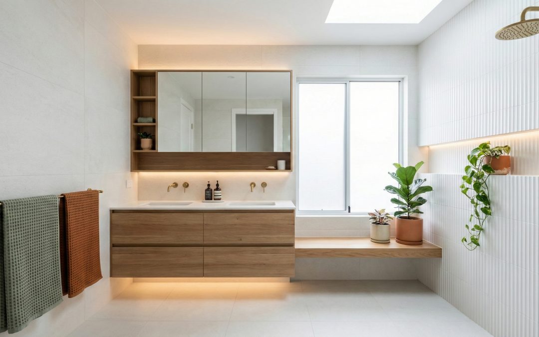
For a classic bathroom scheme, consider white subway tiles (60%), timber vanity (30%), and brass tapware with green plants (10%). This combination works in both modern and traditional homes.
Sydney Home Renovation recommends finalising your colour scheme before purchasing materials. This prevents costly mistakes and ensures cohesive results.
Common Mistakes When Using the Colour Rule
Many homeowners misinterpret the proportions. They calculate by counting items rather than visual surface area. A large white wall counts more than multiple small coloured accessories.
Another mistake is choosing colours in isolation. Always view samples together in your actual space. Lighting dramatically affects colour perception.
Some renovators ignore undertones. A warm white tile next to a cool white paint creates visual discord. Test samples side by side before committing.
Rushing colour decisions leads to regret. Take samples home. View them at different times of day. Live with them for a week before finalising your choices
Adapting the Rule for Different Design Styles
The 60:30 rule flexes across all design aesthetics. Modern minimalist spaces might use three shades of grey. Coastal designs layer whites, blues, and sandy neutrals.
For Hamptons-style bathrooms, white dominates with navy secondary and brass accents. Scandinavian designs use white, timber, and black in the same proportions.
Industrial bathrooms might feature concrete grey (60%), black fixtures (30%), and copper accents (10%). The rule adapts to your preferred aesthetic.
The proportions remain constant regardless of style. Only the specific colours change. This makes the rule universally applicable across renovation projects.
Conclusion
The 60:30 colour rule removes guesswork from your renovation colour choices. It provides a proven framework for creating balanced, appealing spaces.
Sydney Home Renovation helps homeowners apply these principles to their bathroom projects. Our team guides you through colour selection as part of our end-to-end renovation service. We combine transparent cost planning with design expertise to deliver results that stay on budget and look stunning.
Ready to start your bathroom renovation? Contact Sydney Home Renovation for a detailed consultation and quote.
FAQs
What is the 60:30
colour rule in interior design?
The 60:30 rule divides your colour scheme into three proportions. Your dominant colour covers 60% of the space. Secondary colour takes 30%. Accent colour fills the remaining 10%.
How do I calculate the 60:30
ratio in my room?
Calculate by visual surface area, not by counting items. Walls and flooring typically represent your 60%. Furniture and textiles make up 30%. Decorative items and accessories complete the 10%.
Can I use more than three colours with this rule?
Yes, you can use variations within each proportion. Your 60% might include two similar neutrals. Your 30% could feature complementary tones. Keep the overall proportions balanced.
Does the 60:30
rule work for small bathrooms?
Absolutely. Small bathrooms benefit greatly from this rule. Light dominant colours make spaces feel larger. Strategic accent colours add interest without overwhelming.
What are the best dominant colours for bathroom renovations?
White, light grey, and cream remain the most popular choices. These colours reflect light and create a clean, fresh appearance. They also offer maximum flexibility for future updates.
How do I choose colours that work together?
Use a colour wheel as your guide. Complementary colours sit opposite each other. Analogous colours sit beside each other. Both approaches work within the 60:30
framework.
Can I change my colour scheme without renovating?
Yes, that’s the beauty of this system. Your 10% accent colours are easily changeable. New towels, artwork, and accessories can refresh your entire bathroom without construction work.