
The furniture colors defining 2026 interiors centre on warm earth tones, rich terracottas, deep forest greens, and sophisticated warm neutrals like camel and taupe. These shades reflect a broader shift toward grounding, nature-inspired palettes that create calm, inviting spaces while moving away from the cool greys that dominated the past decade.
This matters because furniture represents a significant investment. Choosing colours aligned with current trends ensures your pieces feel fresh and cohesive with contemporary design directions. Whether you’re furnishing a newly renovated space or updating existing rooms, understanding these colour movements helps you make confident decisions.
This guide breaks down the leading furniture colour trends for 2026, explores how to incorporate them into different room styles, and provides practical advice on balancing trendy choices with timeless appeal.
The Shift Away From Cool Greys
The era of cool grey furniture is officially ending. After nearly fifteen years of grey sofas, grey dining chairs, and grey bedroom furniture dominating Australian homes, 2026 marks a decisive pivot toward warmer, more characterful tones.
This shift reflects changing lifestyle priorities. The pandemic years prompted many homeowners to reconsider what they want from their living spaces. Cold, minimalist aesthetics gave way to environments that feel nurturing and personal. Furniture colour choices now prioritise emotional warmth over sleek neutrality.
Grey isn’t disappearing entirely. However, the greys gaining traction in 2026 lean warm. Think greige, mushroom, and stone tones that carry underlying warmth rather than the blue-based cool greys of previous years.
Warm Earth Tones Lead the Trend
Terracotta and Rust
Terracotta has emerged as a defining furniture colour for 2026. This warm, clay-inspired shade brings Mediterranean warmth to Australian interiors while connecting spaces to the natural landscape. Terracotta sofas, accent chairs, and ottomans create instant focal points without overwhelming a room.
Rust tones offer a deeper alternative. These rich, oxidised orange-browns work particularly well in leather furniture, adding sophistication and warmth simultaneously. A rust leather armchair or ottoman introduces colour while maintaining a grounded, masculine edge that balances softer furnishings.
Camel and Tan
Camel-coloured furniture represents the new neutral. This warm, golden-brown shade offers the versatility of grey while delivering significantly more warmth. Camel sofas pair beautifully with both contemporary and traditional interiors, making them a safe yet stylish investment.
Tan leather furniture continues its resurgence. After years of being considered dated, tan leather sofas and chairs now read as classic rather than old-fashioned. The key lies in selecting pieces with clean, modern silhouettes that prevent the colour from feeling retro.
Chocolate and Coffee Browns
Deep brown furniture is experiencing a major comeback. Chocolate-toned sofas, coffee-coloured dining chairs, and espresso bedroom furniture create sophisticated, cocooning environments. These rich browns work exceptionally well in open-plan living spaces where they anchor seating areas without visually fragmenting the room.
The appeal lies in their grounding quality. Deep browns create a sense of stability and permanence that lighter colours cannot achieve. For homeowners seeking furniture that feels substantial and enduring, these tones deliver.
Forest Greens and Nature-Inspired Hues
Deep Forest Green
Forest green furniture has transitioned from trend to established favourite. This deep, saturated green brings nature indoors while offering surprising versatility. A forest green velvet sofa creates drama in a neutral room, while green dining chairs add personality without overwhelming a space.
The colour works across fabric types. Velvet amplifies its richness, linen softens its intensity, and leather gives it a classic, library-inspired quality. This adaptability makes forest green a practical choice for various room styles and personal preferences.
Olive and Sage
Softer greens like olive and sage offer gentler alternatives to deep forest tones. These muted, grey-greens feel calming and contemporary. Olive-toned sofas and armchairs create serene living spaces, while sage dining chairs bring subtle colour to eating areas.
These shades pair particularly well with warm wood tones. The combination of olive upholstery with oak or walnut timber creates a cohesive, nature-inspired palette that feels both current and timeless.
Eucalyptus and Soft Greens
Lighter eucalyptus greens are gaining momentum for bedroom furniture and occasional pieces. These pale, silvery greens feel fresh and airy, making them ideal for smaller spaces or rooms with limited natural light. An eucalyptus-toned headboard or accent chair introduces colour without visual weight.
Bold Accent Colours Making Statements
Burnt Orange
Burnt orange furniture delivers maximum impact. This vibrant, warm shade energises neutral spaces and creates memorable focal points. A burnt orange accent chair or ottoman adds personality to living rooms without requiring a complete colour scheme overhaul.
The key to using burnt orange successfully lies in restraint. One statement piece in this shade makes an impact. Multiple burnt orange items risk overwhelming a space and dating quickly.
Deep Navy and Midnight Blue
Navy furniture continues its strong performance into 2026. This versatile deep blue works as both a neutral alternative and a colour statement depending on context. Navy sofas ground living rooms while navy dining chairs add sophistication to eating spaces.
Midnight blue offers a richer, more dramatic option. This near-black blue creates moody, intimate atmospheres in bedrooms and formal living areas. Velvet midnight blue furniture particularly excels, with the fabric’s sheen highlighting the colour’s depth.
Plum and Aubergine
Purple tones are emerging as unexpected favourites for 2026. Plum and aubergine furniture brings warmth and richness that cooler purples cannot achieve. These sophisticated shades work particularly well in formal spaces and bedrooms where their cocooning quality enhances relaxation.
The New Neutrals
Warm Whites and Creams
Pure white furniture is giving way to warmer alternatives. Cream, ivory, and warm white tones feel softer and more inviting while maintaining the light, airy quality that white provides. These shades work particularly well for larger pieces like sofas and beds where stark white can feel clinical.
The warmth in these tones prevents them from clashing with the earth-toned colour palettes dominating 2026 interiors. A cream sofa pairs seamlessly with terracotta cushions, while an ivory armchair complements camel and tan accessories.
Greige and Warm Greys
For those not ready to abandon grey entirely, greige offers a compromise. This grey-beige hybrid delivers the versatility of grey with added warmth. Greige sofas and sectionals work in virtually any colour scheme while feeling more current than cool grey alternatives.
Mushroom and stone tones fall into this category as well. These warm, earthy greys connect to natural materials and complement the organic aesthetic defining 2026 interiors.
Taupe and Putty
Taupe furniture represents sophisticated neutrality. This complex colour, sitting between grey and brown, offers depth that simpler neutrals lack. Taupe sofas and armchairs create elegant, understated foundations for layered, textured interiors.
Putty tones provide similar versatility with a slightly warmer, more yellow undertone. These shades work exceptionally well with brass and gold hardware, creating cohesive, polished spaces.
How to Choose Furniture Colours for Your Space
Consider Your Existing Palette
Before selecting furniture colours, assess your current interior palette. Note your wall colours, flooring tones, and existing furniture pieces that will remain. New furniture should complement rather than clash with these fixed elements.
For renovated spaces with fresh paint and flooring, you have more flexibility. Consider the overall mood you want to create and select furniture colours that support that vision.
Balance Trends With Longevity
Trendy colours work best for smaller, more affordable pieces. An on-trend accent chair or ottoman can be replaced when styles shift without significant financial impact. Reserve neutral, timeless colours for major investments like sofas and beds.
This approach allows you to participate in colour trends while protecting your budget. A camel sofa with terracotta cushions delivers current style while ensuring the larger piece remains relevant for years.
Account for Natural Light
Room orientation affects how furniture colours appear. North-facing rooms in Australia receive cooler light, making warm furniture colours particularly beneficial. South-facing rooms with abundant warm light can handle cooler tones without feeling cold.
Test fabric samples in your actual space before committing. Colours shift dramatically between showroom lighting and home environments.
Think About Maintenance
Darker furniture colours hide wear and stains more effectively than lighter options. For high-traffic areas and homes with children or pets, consider this practical factor alongside aesthetic preferences.
Performance fabrics now come in virtually every colour, allowing you to choose trendy shades without sacrificing durability. Ask about stain-resistant treatments and cleanability when selecting upholstery.
Room-by-Room Colour Recommendations
Living Room Furniture Colours
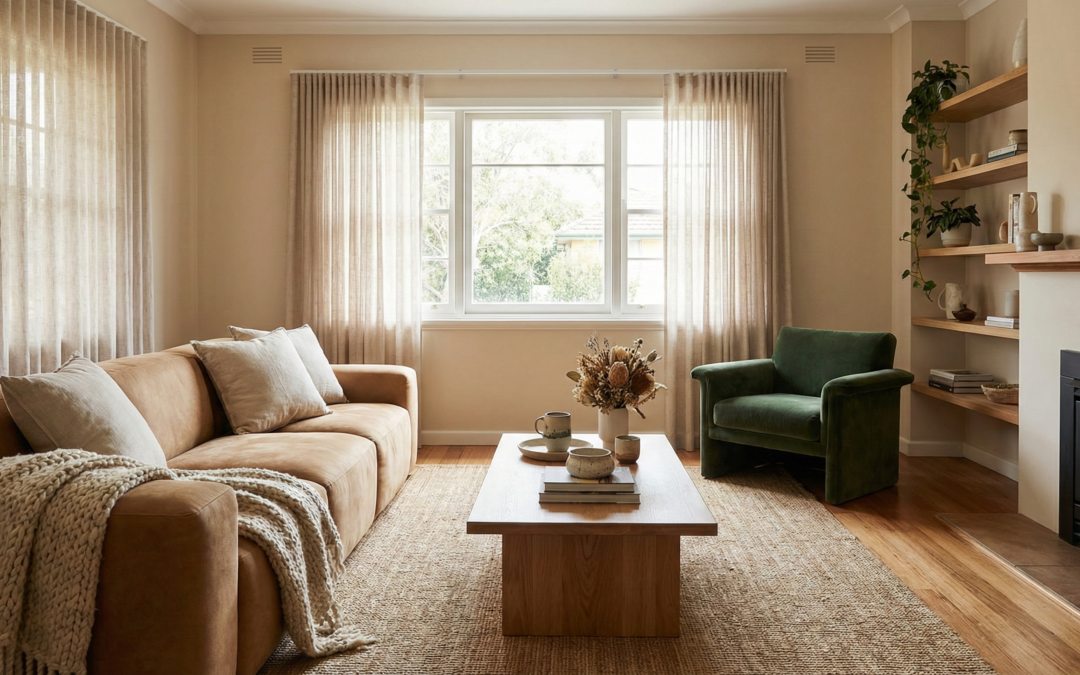
Living rooms benefit from grounding, warm tones. Camel, tan, and warm grey sofas create versatile foundations. Add personality through accent chairs in forest green, terracotta, or burnt orange. Deep brown leather pieces anchor seating arrangements while adding texture.
For open-plan spaces, consistent colour temperatures across furniture pieces create cohesion. Mixing warm neutrals with warm accent colours prevents visual fragmentation.
Bedroom Furniture Colours
Bedrooms suit calming, cocooning colours. Deep greens, soft olives, and warm neutrals promote relaxation. Upholstered beds in these tones create inviting focal points, while timber furniture in warm wood tones complements the palette.
Avoid overly stimulating colours like bright orange or red in bedrooms. These shades can interfere with sleep quality despite their aesthetic appeal.
Dining Room Furniture Colours
Dining spaces offer opportunities for bolder colour choices. Coloured dining chairs around a neutral table create visual interest without overwhelming the space. Navy, forest green, and terracotta chairs all work beautifully in dining settings.
For formal dining rooms, deep browns and rich jewel tones create sophisticated atmospheres. Casual dining areas can embrace lighter, more playful colour combinations.
Mixing Furniture Colours Successfully
The 60-30-10 Rule
This classic design principle applies to furniture colour selection. Approximately 60% of your furniture should be in your dominant neutral colour. 30% can feature a secondary colour, while 10% introduces accent shades.
Applied practically, this might mean a camel sofa (60%), olive armchairs (30%), and terracotta cushions and throws (10%). The formula creates balanced, cohesive spaces without monotony.
Warm With Warm, Cool With Cool
Mixing colour temperatures creates visual tension. For harmonious spaces, keep furniture colours within the same temperature family. Warm earth tones pair with warm greens and warm neutrals. Cool blues work with cool greys and cool greens.
This doesn’t mean avoiding contrast entirely. Rather, it suggests maintaining temperature consistency while varying hue and saturation.
Use Timber as a Unifying Element
Timber furniture in consistent tones unifies spaces featuring multiple upholstery colours. Warm wood tones like oak, walnut, and teak complement the earth-toned palettes dominating 2026. Cool-toned timbers like ash work better with cooler colour schemes.
Matching timber tones across coffee tables, side tables, and dining furniture creates visual continuity even when upholstered pieces vary in colour.
Investment Pieces Versus Trend Pieces
Where to Invest
Sofas, beds, and dining tables represent significant investments. Choose timeless colours for these pieces. Warm neutrals like camel, taupe, and warm grey offer longevity while remaining current. Quality pieces in these shades will serve you well for a decade or more.
Leather furniture in tan or chocolate brown also represents sound investment. These colours improve with age, developing patina that enhances rather than diminishes their appeal.
Where to Trend
Accent chairs, ottomans, and occasional pieces suit trendier colour choices. These smaller items cost less to replace when styles evolve. A terracotta accent chair or forest green ottoman allows you to embrace current trends without long-term commitment.
Cushions, throws, and other soft furnishings offer the lowest-risk way to incorporate trend colours. Update these accessories seasonally or as preferences change.
Conclusion
The furniture colours defining 2026 reflect a collective desire for warmth, comfort, and connection to nature. Earth tones, forest greens, and sophisticated warm neutrals create spaces that feel nurturing and grounded. Moving away from cool greys toward these warmer palettes transforms how homes feel and function.
At Sydney Home Renovation, we understand that furniture selection is just one element of creating your ideal home. Our renovation expertise helps homeowners transform spaces that showcase their furniture investments beautifully, from flooring choices that complement your colour palette to lighting that enhances your selected tones.
Ready to create a renovated space worthy of your furniture vision? Contact Sydney Home Renovation to discuss how we can help you build the foundation for your dream interior.
Frequently Asked Questions
What is the most popular furniture colour for 2026?
Warm earth tones lead 2026 furniture trends, with camel and terracotta emerging as the most popular choices. These colours offer warmth and sophistication while providing versatility across different interior styles.
Is grey furniture still in style in 2026?
Grey furniture remains acceptable but has shifted toward warmer tones. Cool greys are declining while greige, mushroom, and warm grey alternatives maintain relevance. Pure cool grey now reads as dated compared to warmer neutral options.
What colours go with terracotta furniture?
Terracotta pairs beautifully with cream, warm white, olive green, and deep navy. Natural materials like timber, rattan, and linen complement terracotta’s earthy quality. Avoid pairing with cool greys or bright whites, which create jarring temperature contrasts.
Should I choose trendy or timeless furniture colours?
Choose timeless colours for major investments like sofas and beds. Reserve trendy colours for accent pieces, occasional chairs, and accessories that cost less to replace. This approach allows trend participation while protecting your budget.
What furniture colours make a room look bigger?
Lighter colours like cream, warm white, and soft greige create the illusion of more space. However, a single dark furniture piece can anchor a room without making it feel smaller. Balance is key in smaller spaces.
How do I mix different furniture colours in one room?
Follow the 60-30-10 rule: 60% dominant neutral, 30% secondary colour, 10% accent. Keep colours within the same temperature family for harmony. Use consistent timber tones across wooden pieces to unify varied upholstery colours.
What furniture colours work best with timber floors?
Warm furniture colours complement warm timber floors like oak and spotted gum. Earth tones, warm neutrals, and forest greens create cohesive palettes. Match the undertone of your flooring when selecting furniture colours for best results.